Wednesday, July 31, 2013

Fabulous Forever Fall

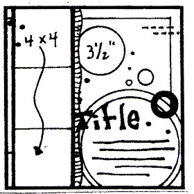
 Hi! Today I have a layout using some of the fabulous Forever Fall line by Moxxie! This line is absolutely gorgeous!! Last fall I took my family out to do photos and found some really beautiful trees with such awesome color variation of leaves on them that I had to stop to do the photos right there. And of course these papers were just perfect for those photos. (so you just might see more)


This is my youngest daughter. As you can see, she's got a pretty big personality and she loves owls, so her little buddy had to be in the photo too. This paper made the perfect background for my photo. It looked so good I didn't want to add anything at first. So I decided to dress up my photo a bit instead. I layered black cs, the B side of this same paper and the B side of Fall Cards for my photo mat.


I used a border punch on the bottom layer and fussy cut the leaves on either side of the mat, so that I could slip it beneath and not have any of those beautiful leaves covered. I had to have the adorable owl sticker on here too. He's just too perfect!


I did more layering for the title, used the alpha stickers and added some stickles to them. I also cut a journaling block out, added the pretty fall leaf tab to it and put it between the layers of the photo mat for hidden journaling. I did a little distressing with ink, added some stickles to the the leaf design on either side of the photo and added the bit of border punched strip to the top as a final touch.
   I hope you like this Fall line as much as I do. I know I'll be getting a lot of use out of it! Thanks for stopping by today. :)Ange

Supplies:
Moxxie - pp, stickers, alphas
paper studio - black cs
martha stewart - loop border/corner punch
ranger - ink, cinnamon stickles
tombow - tape runner
stash - orange staples

Monday, July 29, 2013

Wedding cards?

 Oh yes! It's not just June that you need wedding cards is it? lol I was in need of a couple when I was looking at this week's sketch from Nuts About Sketches and well, let's be honest, this sketch is perfect for cards too! Here's the sketch:


And here are my cards that I made using it:


I think it's fairly easy to see the sketch in each card. I misted the backgrounds a bit, added the chevron and squared papers (all from Moxxie's new Fighting Back line) that were all distressed and then I went separate ways with my cards. On the left I stayed more with the title portion of the sketch adding the Love is... & scallop border stickers from SRM Stickers. Then I put some cute pink buttons tied with black DMC floss on & some pink bling from Imaginisce along the scallop border.  (click photo for a larger view)

With the card on the right I kept with the big circle element of the sketch and added this fun chevron circle sticker from Moxxie, along with some bling that's been in my stash a little too long. Then I grabbed this SRM flower sticker, put it on a scrap of the Moxxie paper I'd been using and cut it out into a circle to add to the center.

Thanks so much for stopping by today! :)Ange

Supplies:
Nuts About Sketches - #276
Moxxie - pp, pink scallop circle
SRM stickers - Love is, flowers, scallop border
studio calico - passport mist
sei - buttons
imaginisce - pink bling
dmc - floss
stash - bling, white cs

Friday, July 19, 2013

Get scrappin' with Imaginisce and Scrapbook USA!!

  Love me some Imaginisce!
I brought home some Childhood Memories with me from the Original Scrapbook USA Expo. The papers are so cute and would go great with so many different photos. These photos of my son throwing a rock caught my eye, but it's actually my teenage daughter in the background that made me want to use these photos for this line. Here's the layout I made:


I came up with the idea for the "You've been Photo Bombed" frame after seeing the polaroid cameras in this collection. I think it turned out pretty cute. I also used the July sketch challenge that Imaginisce has on their blog. Not only do they offer awesome products but fun challenges to get you scrappin'!
 Here's a few closeups:


I added my journaling on scraps I had laying on my desk from my previous layout and I had to have this polaroid sticker stack on here. I love it, so I added a random but fitting phrase with the alpha stickers that came with the line (4, yes I said FOUR, different alphas on one sheet, awesome!)


Here you can see my daughter a little better. Sneaky little thing! lol


Last but not least, a closeup of the polaroid frame I made. Love how it turned out! Thanks for stopping by today and don't forget to check out the challenges on the Imaginisce blog! I hope you have a scrap happy day. :)Ange

Supplies:
Imaginisce - pp, stickers, sticker stack (camera)
ranger - dylusions ink spray, brown ink
stampin up - brown marker
tombow - tape runner
ek success - foam adhesive
silhouette - photo bombed frame


Monday, July 15, 2013

Soccer Star w/ Moxxie & NAS

 I'm going to jump right to it today. I used this NAS sketch:


And the NEW Moxxie Soccer line! I could not wait to use this line!! It's so awesome! I have 2 kids that play soccer, so I'm going to get a lot of use out of this line (I already know, I'll need more). These photos are of my oldest son. He's such a great soccer player, he really just plays hard where ever you put him. These are photos of him playing goalie and practicing his drop kick, he improved it a lot this season.


I let the sweet design on this paper represent the top and bottom part of the sketch design, but I put the entire middle into it. I cut the circle behind the photos from the B side of Kick It, then inked the edge to give it more dimension.
For my polariods I just cut a rectangle of white cardstock and then added my 3x3 photos. I did run a black pen around the outside of the photo and then inked around the edges of the white cs. The title "Soccer Star" is Moxxie's rub-ons, they go on SO smooth. They don't stick before you want them too, but they don't stick to their backing while you rub and rub either. LOVE them!


I used a craft knife to cut around the part of the flourish and star that was going to be covered by my photo backing, so I could slide the photo underneath.


 Here I just used a star border punch I have to add some star confetti.


These stickers are part of the Moxxie Soccer line. I just added a bit of pen stitches to pop them off the page a bit.

So, what do you think of Moxxie's new Soccer line?
Thanks for stopping by today! :)Ange

Supplies:
Moxxie - pp, stickers, rub-ons
NAS - sketch #274
ek tools - star border punch, smash date stamp
zig - black pens, 2-way glue pen
colorbox - ink
paper studio - black cs
tombow - tape runner
stash - white cs

Saturday, July 13, 2013

*NEW* from Moxxie

And I can't WAIT to play with them!!!


We just recently attended a minor league baseball game where I made sure to get some fun photos! Plus my son played rec league this year and I got some sweet photos of him playing catcher. I am SO excited to use this line!


Moxxie comes out with the BEST hope, courage and fighting lines I have ever seen. So great for those that have these kind of battles in their lives, whether for themselves or their loved ones. I love that the B sides coordinate perfectly with the line or could be used for something entirely different.

 This is GORGEOUS! I love the patterns they chose to pair with those rich, fall colors and the little critters on the stickers and rub-ons are so cute!!!


Magical Moments is perfect for your Disney memories! But one of the things I so love about this line is how easy it would be to use for so many other non-Disney summer/kid moments. This is just an all around fabulous line.


I have to be honest. This line surprised me a little. We had been told there was a 'gardening' line and my mind leaped straight to bold colored veggies. You know, solid greens and bright reds and yellows. lol So you can imagine my surprise to see this line. However, I already have some fun ideas in mind and a super cute photo on my desk ready to go!


Last, but definitely not least is this fabulous Soccer line! I have 2 kids that love soccer, so I have plenty of photos waiting for this rockin' line. I can't wait to get started!

Thanks for previewing the new lines with me. Leave a comment telling me what your must-haves are. :)Ange

Thursday, July 11, 2013

Baby album

Ok here it is, in it's entirety. You've seen a few pages here and there as I've posted for Nuts About Sketches, but I wanted to put the entire baby album I made all in one post. So here it is:


I created this page as a starter page. I wanted to have a big, raised photo spot for the baby's photo, a huge journaling spot for the story and a short listed spot for the big details like weight, length...


I created this layout for the The Orginial Scrapbook Expo competition we had last March. Shawn, from Nuts About Sketches was kind enough to provide the sketch. I LOVED using the sketch and I think the ladies attending the Expo loved it. There were a LOT of amazing entries! The post about this layout can be found HERE.
 

I took this photo with the layout already in page protectors and ready to go to the new owner. I wanted to have a spot in the album at about every three months for lots of photos and lots of details, so these pages are very similar.


Another beautiful NAS sketch layout. I tried to leave backing on embellishments that would possibly overlap photos. I really like overlapping photos, I think it really pulls a page together. However, creating w/o photos can be a challenge. lol The details for this layout can be found HERE.


 This is the most recently posted layout I did. I used a one page sketch that I first rotated and then stretched it out to be a 2 page layout. I think it shows what you can do with a sketch and a little imagination. You can see the post HERE.


Like the 3 month page, I wanted this page to have lots of photo and journaling room. It's a little hard to see, but I added some hand drawn stitches for the top and bottom borders.


To make my pages flow together as an album, I stuck with the same scrapbook line from Simple Stories, kraft cs as a background and used brown ink or green mist on a lot of the layouts.


 This was created from a Nuts sketch. I first did it with a Moxxie line called Wee Ones and loved it so much that I used it again for the album. It was super cute and easy to put this layout together after already having used it for another layout. You can see the Wee Ones layout and sketch HERE. On the twinkle card, I used a craft knife to cut around most of the stars and then raised them from the bottom to slide a pop-dot under each one, giving them dimension w/o actually cutting them all the way off the card.


 This is just a slight variation on the 6 month layout. I did really enjoying adding the measuring tape along the top and bottom, since this is all about watching a baby grow. Love me some washi tape!


To help me create a good amount of photo space on this layout, I grabbed some 4x6 photos that were laying nearby and put them on the right side. Then I laid my embellishments out around them. I did add some photo mats on some of the layouts, as you can see here on the left side. But one of my biggest pet peeves about pre-done layouts is that it makes it hard to use the picture I want, in the size I want. So I tried to create pages that left you with options. I figured it would be easy enough to add suggested sizes with little sticky notes on the page protectors.


This is another layout created using a Nuts sketch. You can see the entire post HERE. I definitely went with the 'cute as a button' theme.


 I created this as a bit of a variation on the 3, 6 and 9 month layouts, but I wanted it to be special because it's the last layout and represents the full year. So I've got a good amount of room for pictures and journaling along with space to do large photos if you desired and I thought a Birthday banner was more than appropriate.

I'd love to know what you think! Tell me about any helpful hints you've discovered while building themed albums. I would love for you to become a follower and thanks for stopping by today. :)Ange

Monday, July 8, 2013

Our little Guy

If you are looking for the Moxxie blog hop just scroll down, it's the next post. :)

 I mixed it up a bit for today's Nuts About Sketches layout. First let me show you the sketch and then I'll explain what I did:
This is a fun sketch, but I was still working on a baby book when I decided to use it. So after looking at the sketch a little I decided that on it's side and stretched it would make a fabulous 2 page layout. And that is exactly what I did:


I just added more paper strips to widen it into a 2 page layout but kept the feel of the sketch on the left side and by running the twine as the borders across both pages. I think it turned out pretty good and this just shows you how you can take inspiration from any sketch to get the results that you want.
Here are a few close-ups of the details:


I outlined "guy" with marker to help it pop


I added the twine bow here after adhering the twine. So it's not actually tied here and it helps the bow lay a little prettier.


I know there are many people who like to stick with 2 page layouts, so hopefully this will help you see the second page in every sketch. Thanks for stopping by! :)Ange

Supplies:
Nuts About sketches - sketch #273
simple stories - pp, stickers
paper studios - kraft cs
tattered angels - glimmer mist
tombow - tape runner
stash - twine, metal embellies, brads

Friday, July 5, 2013

July Moxxie Hop! + giveaway!!!

Hi Everyone,
Guess what day is today?  Yes, that is correct.  It is the first Friday of the month and that means it is Moxxie Blog Hop time.  This month we are going to shake things up just a bit!  Design Team Member Mary Pat Siehl has created another sketch for you and each Muse will show you their take on the sketch.  The Muses will be using all different Moxxie collections.  It is going to be so fun to see what collections the Muses are using and to see how each one interprets the sketch.

So let's get us started!  This sketch is very fun and lends itself to many different interpretations.


Here is what I did with the sketch using mostly Happy Camper with a touch of Fish Stories. Since my picture was vertical I made some changes to the sketch to accommodate my photo:


 I had this wonderful picture of my youngest getting a piggy back from his dad on a hike and thought it would go great with the Happy Camper line. I love how easy it is to put a page together using the stickers and die-cuts that come with the lines.


I used my silhouette to make my title. I misted it a little too much but it's easy to read in person so it worked out great and I love the 'dirty' feel of it.

So have I mentioned the Giveaway?  This month one winner will win ONE ENTIRE COLLECTION of their choosing from the Moxxie store.  Isn't that just so awesome????  I know!  It totally rocks!  (International fans are welcome to play along and just cover shipping should they win.)

I hope you had fun hopping with us today. Don't forget to stop by the Moxxie blog and leave a comment there. Good luck! :)Ange

Here are the Moxxie Muse's links, in case you missed any.  Simply hop to ALL the blogs and Leave a Comment. Don't forget the final stop- The Moxxie Blog and leave a comment there.  


Monday, July 1, 2013

So cute!

 Shawn has a fabulous 2 page sketch for us today over at Nuts About Sketches. But before I show you I want to say, the thing I love the most about sketches is that they're just an idea to get you going. So whether you use the sketch as a blueprint and follow it to the letter or just get inspired by one small element, then the sketch was useful. I often follow sketches very closely so you can see the sketch in my finished layout. But you don't have to, have fun with it!
  Ok, now onto today's awesome sketch:

My favorite things about this sketch are the amount of 4x6 sized (or close to that size) photos you can put on it and the circles. I used this sketch to help me finish up the baby book I was working on. Here is my layout:


Originally I planned to have the green misting represent the circles in the sketch but doing it with the pp added so much to the layout, I'm glad I did it.
Here are a  few close-ups:

I fussy cut this cute little owl out of one of the bingo cards that come with this line.

Thanks so much for dropping by and don't forget to become a follower! :)Ange

Supplies:
Nuts About Sketches - sketch
Simple Stories - pp, stickers
pebbles - 3D element
Moxxie - buttons
srm stickers - stitches stickers
paper studio - kraft cs
tattered angels - glimmer mist
ranger - ink
tombow - tape runner