Friday, March 25, 2022

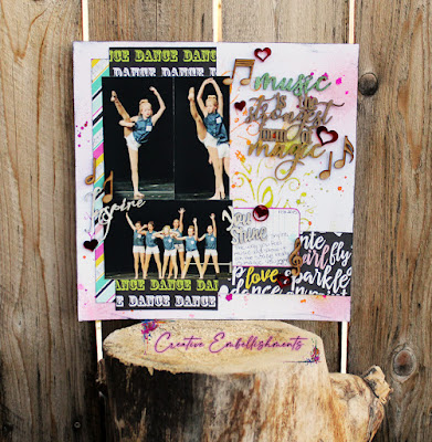
Music Magic layout

 Hello!
Tis the season for a dance layout right?
Good, because I have one for you today.


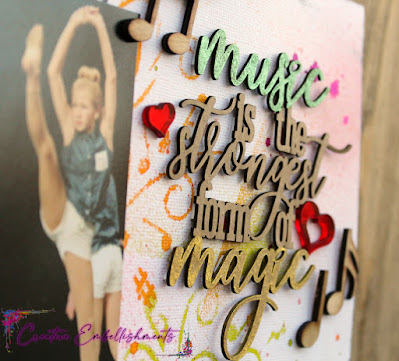
I created this layout around the title piece that I got from Creative Embellishments.


I had so much fun using glittery mists to highlight certain words in this title piece. It turned out great!
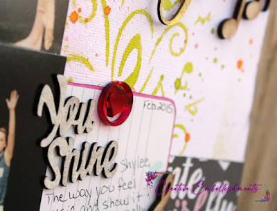
On my background I started with ink sprays and the Music to my Ears stencil.


I finished up my layout with some great words from words sets in the store and then added wood veneer music notes and my well loved acrylic hearts!

Thanks for stopping by today!
Angela W

Friday, March 18, 2022

I'm so lucky he's my #sweetheart

 This boy of mine is so cute!
I really love scrapping pics of the kids when they were young and I was definitely a better photographer with my last kid. So that whole, you take less pics of each kid, did not really pan out with me. lol


Here he's just being his cute little self while showing off his mohawk.


I used wood veneer shamrocks and this chipboard hashtag word from Creative Embellishments, but I sprayed them with Mr Hueys Gold color mists and I got some really fabulous shine!
When I first took photos it was later at night, so the natural light was crap and I turned on a porch light to help. The shine these put off was awesome! I couldn't quite get the same shine in natural light but I think you can see it pretty good in this photo and it's even better in person.
These embellishments took up that mist like a charm and I am super happy with how it turned out.


I finished up with some word strip journaling and these fantastic red acrylic hearts, also from Creative Embellishments. They've got stars in various colors and I can't wait to get my hands on some!


Thanks for stopping by today!
:)Angela


Wednesday, March 16, 2022

Talk Wrestling layout

 We're getting a bit more sunshine around here and it feels fantastic!
Love me some sun and warmth.


Today I'm sharing a layout made for Scrap Our Stash challenge:


The challenge was to use the following sketch with circles on your layout.


Sometimes when you're looking at a sketch the colors or elements they use to design it can limit the potential you see in the sketch. That's one of the reasons I always turn my sketches to black and white. I find that color on a sketch is one of the most distracting things for me. But beyond that sometimes you can see flowers or hearts as embellishment place holders and it makes you think of certain photos or themes.
As you can see I change that up quite a bit too. My go to for embellishments are stars. I feel like they go with almost anything and I love them.
They were perfect for this photo of my son and husband watching and discussing their favorite sport; Wrestling.

Thanks for stopping by today!
:)Angela


Friday, March 11, 2022

Lucky in Love layout

 Hey there!
I'm back today with another layout using Creative Embellishment products!
Check it out:


This was a super fun and quick layout.
We don't do a lot of celebrating for St. Patrick's Day, but that doesn't mean I don't have papers I want to use. lol
I decided to use this awesome "Lucky in Love" title and do some pics of my littlest guy who was nearly not a part of our family.


I used a gold chalk marker on the title, then added some wood veneer shamrocks with a bit of green marker to help outline them and make them pop. Last I added some of the awesome flair buttons and one acrylic heart.

Thank you for stopping by today!
:)Angela


Tuesday, March 8, 2022

Super Smile layout

 Hello!
Today I'm sharing a layout based on this sketch from Sketches In Thyme:


Such a great sketch!
And here is the layout I made:


I was really happy to use some bright colors and scrap a truly spring-y layout.
I'm SO ready for SPRING!!!


Thanks for stopping by!
:)Angela


Wednesday, March 2, 2022

No flowers here, Spring is for Softball layout

Wow, March already.
This year is going to fly by!

Today I'm using the challenge from Scrap Our Stash.
It's to make a Spring themed layout and you must use flowers.

So your first thought might not be a Softball layout.
But when I was looking through some of my March photos I found indoor soccer, basketball, softball, wrestling, some people taking naps on the living room couch and some dance photos.
I could have picked some of the dance photos, you know, flowers always go great with dance.
But I'm not exactly the traditional type most of the time and I was thinking "spring isn't for flowers, it's for softball"

Thus the birth of my title
(It's more me and my girls than flowers anyway)


So I picked out the softball photos, picked a spring line I had from a Scrap Room kit and got to work dirtying it up for my layout.
As you can see, a great way to add flowers w/o overwhelming the layout with them and making them the dominant theme w/o them dominating your photos.

Thanks for stopping in!
:)Angela